SwiftUI Toggle is a UI control that enables users to switch between two states, typically represented as on and off. If you are building a view where you can enable a feature, then the Toggle view is the way to go.
With very little code you can implement a simple and effective way of getting user input. In this blog post we will cover how to implement a Toggle switch, change the color, hide the label and execute a function when turned on.
SwiftUI Toggle example
Let’s start with the most basic example of a Toggle in SwiftUI. Using Toggle is straightforward first define a state variable that holds the state of the toggle and then create a toggle view and bind the variable.
import SwiftUI

struct ToggleView: View {
    @State var isToggleOn: Bool = false

    var body: some View {
        Toggle("Basic toggle example", isOn: $isToggleOn)
    }
}
The result:

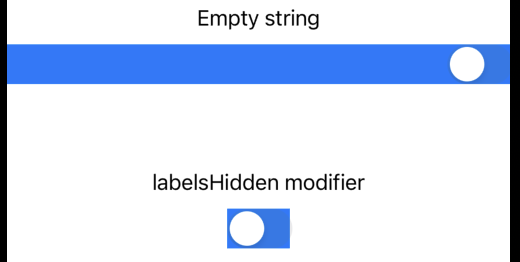
SwiftUI Toggle without label
Sometimes you just want a toggle without a label. When you want to create a Toggle there are two ways you can go:
- Create a Toggle with an empty string.
- Create a Toggle and use the .labelsHidden() modifier.
The only difference is if you choose option 1, the toggle view will use the full width, and if you use option it won’t.
In the following example, you can see the two different options:
import SwiftUI

struct ToggleView: View {
    @State var isToggleOn: Bool = false

    var body: some View {
        Text("Empty string")
        Toggle("", isOn: $isToggleOn)
            .background(Color.blue)

        VStack {
            Text("labelsHidden modifier")
            Toggle("", isOn: $isToggleOn)
                .labelsHidden()
                .background(Color.blue)
        }
    }
}
The result:
SwiftUI toggle color
You can easily make your application unique by just changing the color of the Toggle. To change the color of the toggle button, when it’s enabled, all you need to do is to add the .tint modifier.
In the following example, we will change the active color of the toggle to red:
import SwiftUI

struct ToggleView: View {
    @State var isToggleOn: Bool = false

    var body: some View {
        Toggle("Color tint", isOn: $isToggleOn)
            .tint(.red)
    }
}
The result:

SwiftUI toggle callback
When working with the toggle, you can either set a boolean value by toggling or call a function when the toggle is set.
You can use no action right off the bat, but you can use the .onChange modifier.
In the following example, we will call a function called toggleAction() when the toggle is set to true — the two examples provide the same result, but one is for iOS17 and the other is for iOS before 17:
iOS17+:
Toggle("onChange", isOn: $isToggleOn)
    .onChange(of: isToggleOn) { oldValue, newValue in
        if newValue {
            toggleAction()
        }
    }
Before iOS17:
Toggle("onChange", isOn: $isToggleOn)
    .onChange(of: isToggleOn) { result in
        if result {
            toggleAction()
        }
    }
Wrap up SwiftUI Toggle
The toggle view is a great tool and perfect if you want your users to turn something on or off. Like changing from dark to light mode in your application.
I hope you in this guide learned how easy it is to implement a toggle in SwiftUI. We also covered how to create a toggle without a label, change the color, and call a function when the toggle is activated.
Thank you for reading this post about toggle and happy coding 🙂