SwiftUI ColorPicker enhances the user experience by providing an interactive and visually pleasing way to select colors.
In this blog post dive into the SwiftUI ColorPicker, exploring its functionality and how it simplifies the process of color selection within your SwiftUI applications.
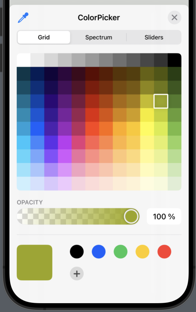
SwiftUI ColorPicker example
The SwiftUI ColorPicker is designed to be straightforward and user-friendly. To integrate it into your project, you only need a minimal amount of code — all you need is a state variable that holds the selected color and then a ColorPicker.
Here is the most basic example of how to implement a ColorPicker:
import SwiftUI

struct ColorPickerView: View {
    @State var color = Color.red
    var body: some View {
        ColorPicker("ColorPicker", selection: $color)
    }
}
The result:
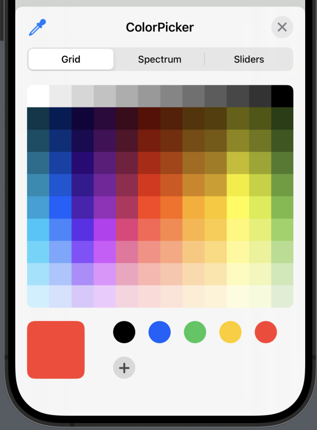
ColorPicker disable Opacity
When implementing a ColorPicker you can choose opacity, but if you want to, you can easily disable opacity by using supportsOpacity and set it to false.
In the following example we will create a ColorPicker without the opacity option:
import SwiftUI

struct ColorPickerView: View {
    @State var color = Color.red
    var body: some View {
        ColorPicker("ColorPicker",
                    selection: $color,
                    supportsOpacity: false)
    }
}
The result:
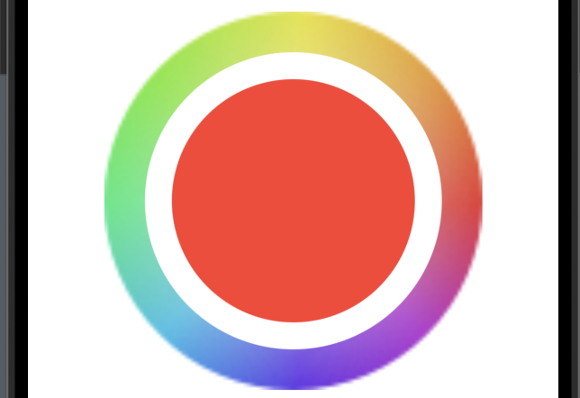
SwiftUI ColorPicker without label
By default the colorpicker has a label and a color wheel. The color wheel shows the selected color and the label says whatever you want to say — something like “Pick a color”.
But some times you don’t want to show the label, and in order of hiding the label, simply use the .labelsHidden() modifier like so:
import SwiftUI

struct ColorPickerView: View {
    @State var color = Color.red
    var body: some View {
        ColorPicker("",
                    selection: $color,
                    supportsOpacity: false)
        .labelsHidden()
    }
}
SwiftUI ColorPicker wheel size
The color wheel is awesome and it shows the selected color, a really useful feautre and it comes right out of the box. But it can be quite small, so in order of making the color wheel larger, we can use the .scaleEffect with CGSize to make the wheel larger.
In order of using .scaleEffect we first need to hide the label by using .labelsHidden() modifier.
In the following example we will make the color wheel quite large:
import SwiftUI

struct ColorPickerView: View {
    @State var color = Color.red
    var body: some View {
        ColorPicker("",
                    selection: $color,
                    supportsOpacity: false)
        .scaleEffect(CGSize(width: 10, height: 10))
        .labelsHidden()
    }
}
The result:
Wrap up
The SwiftUI ColorPicker is a awesome tool and really all you need when you want your users to pick a color. In this blog post we covered how to implement the ColorPicker and learned how to custorimze it a bit.
I hope you enjoyed the post about ColorPicker in SwiftUI and can use it in your project — thanks for reading and happy coding 🙂