When it comes to creating visually stunning and captivating user interfaces, SwiftUI gradient are a design element that should not be overlooked. SwiftUI Gradients provide a seamless blend of colors that can add depth, dimension, and a touch of elegance to your app’s UI.
In this article about SwiftUI gradient, we’ll uncover the power of gradients and how to integrate them seamlessly into your app’s design.
Gradient in SwiftUI
There are three different gradient types in SwiftUI: LinearGradient, RadialGradient and AngularGradient.
In the following we will uncover how the three different gradient types work and after that we will dive into som specific use cases.
LinearGradient
One of the most common used types of gradient, that I have seen, must be the Linear one. LinearGradient is a SwiftUI view modifier that creates a gradient transition between two or more colors along a straight line.
When creating linear gradient you need to provide a start and end point. You do that by providing a start UnitPoint and end UnitPoint like .leading or .trailing.
In the following example we will create a large text element and create a linear gradient from left to right with the colors gray and green:
struct GradientExampleView: View {
    var body: some View {
        Rectangle()
            .fill(
                LinearGradient(
                    gradient: Gradient(colors: [.gray, .green]),
                    startPoint: .leading,
                    endPoint: .trailing)
            )
            .frame(width: 300, height:  100)
    }
}
The result:

RadialGradient
RadialGradient creates a gradient transition between two or more colors in a circular pattern. Unlike the linear gradient, which transitions colors along a straight line, the radial gradient transitions colors from a central point outward in a radial manner. This can be used to create circular and immersive visual effects in your user interface.
In the following example we will create a radial gradient with a red center and turning into yellow:
struct GradientExampleView: View {
    var body: some View {
        Rectangle()
            .fill(
                RadialGradient(gradient:
                                Gradient(
                                    colors: [.red, .yellow]),
                               center: .center,
                               startRadius: 1, endRadius: 100)
            )
            .frame(width: 300, height:  100)
    }
}
The result:

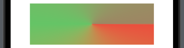
AngularGradient
AngularGradient changes color as the angle changes, it goes round and is pretty special.
In the following example we will create the most basic form of angular gradient:
struct GradientExampleView: View {
    var body: some View {
        Rectangle()
            .fill(
                AngularGradient(
                    colors: [.red, .green, .brown],
                    center: .center)
            )
            .frame(width: 300, height:  100)

    }
}
The result:
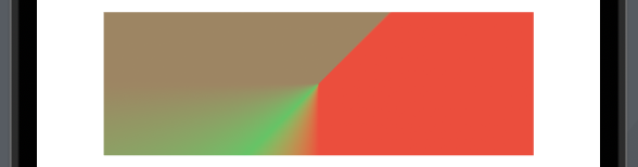
When using angular gradient you can also specify the start angle and end angle:
struct GradientExampleView: View {
    var body: some View {
        Rectangle()
            .fill(
                AngularGradient(
                    colors: [.red, .green, .brown],
                    center: .center,
                    startAngle: .degrees(90),
                    endAngle: .degrees(180))
            )
            .frame(width: 300, height:  100)

    }
}
The result:
SwiftUI gradient overlay
One of the most common use cases of gradient if properly to create a linear gradient overlay over a image.
In the following we will create a linear gradient over a image starting from the top going to the bottom. We will be using the modifier .clear as the first color and then fade to black:
struct GradientExampleView: View {
    var body: some View {
        VStack {
            Image("thank-you")
                .resizable()
                .scaledToFit()
                .overlay(
                    LinearGradient(gradient: Gradient(colors: [.clear, .black]),
                                   startPoint: .top,
                                   endPoint: .bottom)
                )
        }
    }
}
The result:
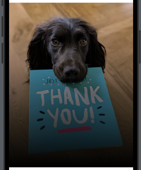
Note if you think the black is a bit too dark, then use the .opacity modifier on the black color.
.overlay(
    LinearGradient(gradient: Gradient(colors: [.clear, .black.opacity(0.4)]),
                   startPoint: .top,
                   endPoint: .bottom)
)
How do I add gradient color to text in SwiftUI?
In the basic example above we created different gradient backgrounds for a rectangle. Like the rectangles sometimes you want your text to have the gradient feature.
In the following we will write “Best app in the world” and add a LinearGradient with green, pink, blue and yellow to it to make it standout:
struct GradientExampleView: View {
    var body: some View {
        Text("Best app in the world")
            .font(Font.system(size: 40, weight: .bold))
            .foregroundStyle(
                LinearGradient(
                    colors: [.green, .pink, .blue, .yellow],
                           startPoint: .leading,
                           endPoint: .trailing
                       )
            )
    }
}
The result:

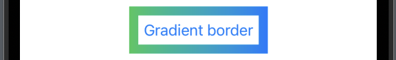
SwiftUI gradient border
Let’s say you have a button you want to make a bit more special then the other buttons, then you might take a look at making the border gradient.
In the following example we will create a button with a nice looking gradient border:
struct GradientExampleView: View {
    var body: some View {
        Button("Gradient border") {

        }
        .padding()
        .border(
            LinearGradient(
                colors: [.green, .blue],
                startPoint: .leading,
                endPoint: .trailing
            ),
            width: 10
        )
    }
}
The result:
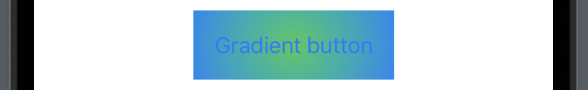
How to add gradient to button in SwiftUI?
Now it’s time to add a gradient background for a button. All we need to do is add the .background modifier and create a gradient.
In the following we will create a button and add a RadialGradient as a background:
struct GradientExampleView: View {
    var body: some View {
        Button("Gradient button") {

        }
        .padding()
        .background(
            RadialGradient(
                colors: [.green, .blue],
                center: .center,
                startRadius: 1,
                endRadius: 90)
        )
    }
}
The result:
Wrap up gradient in SwiftUI
Incorporating SwiftUI gradients into your app’s design can elevate its visual appeal and user experience. In this blog post I hope you have learned what you need to know and can implement gradient in your app. By mastering the art of gradient creation, you have the power to guide users attention.
Happy coding 🙂