An image carousel, also known as an image slider or image gallery, is a UI component that displays a series of images sequentially, allowing users to swipe or navigate through them horizontally or vertically. Image carousels are commonly used in various applications such as e-commerce platforms, news apps, and social media platforms to showcase content appealingly and interactively.
In this blog post, we will be making a reusable image carousel that is intuitive and we will also add the option to enable a timer, so the images slide when the carousel appears.
How do I make a carousel in SwiftUI?
In the following example we will make an image carousel with an array of images and at the bottom of the view, we will add dots as indicators so you can easily and intuitively scroll through the images.
We will make our image carousel view reusable so that another view can call it and the parent view decides the images that should be displayed.
Let’s start by making the carousel and then we will make the view that uses it.
To make the carousel we will be using a ZStack, TabView, and a ForEach. The ZStack is so that dot indicators are displayed at the bottom of the image, the TabView is to create the dots at the bottom and ForEach is so we can loop the images and display them. Enough text — let’s code!
import SwiftUI

struct ImageCarousel: View {
    @State private var selection = 0

    var images: [String] = []
    var body: some View {
        ZStack{
            TabView(selection : $selection){
                ForEach(0..<images.count, id: \.self){ index in
                    Image("\(images[index])")
                        .resizable()
                }
            }
            .tabViewStyle(.page)
            .indexViewStyle(
                .page(backgroundDisplayMode: .always)
            )
        }
    }
}
Now it’s time to create the view that displays the image carousel:
import SwiftUI

struct UseImageCarouselView: View {
    var body: some View {
        VStack {
            Text("Welcome to image viewer")
                .font(.title)
            ImageCarousel(images: ["lake-boat","swim-water","mounatins", "town"])
        }

    }
}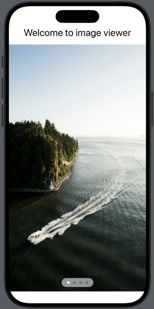
As you can see it is quite easy to create an image carousel in SwiftUI. The two modifiers: .tabViewStyle & .indexViewStyle are used to display the bottom dots indicator.
SwiftUI autoplay image carousel
We have created an image carousel that works just fine with dot indicators, now it’s time to add the option for the images to auto switch.
We will achieve this by attaching a timer and then adding a .onReceive that listens to the timer and then switches the image. We will make it so that the timer only starts if the view that uses the image carousel tells it to start.
So in the following we will modify the code and add a bool variable called isAutoPlay, we add .onReceive modifier to our TabView with logic to switch the image and we will add .onAppear modifier to start the timer:
struct ImageCarousel: View {
    @State var isAutoPlay: Bool = false
    @State private var selection = 0

    var images: [String] = ["lake-boat","swim-water","mounatins", "town"]
    var timer = Timer.publish(every: 2, on: .main, in: .common)
    var body: some View {
        ZStack{
            TabView(selection : $selection){
                ForEach(0..<images.count, id: \.self){ index in
                    Image("\(images[index])")
                        .resizable()
                }
            }
            .tabViewStyle(.page)
            .indexViewStyle(
                .page(backgroundDisplayMode: .always)
            )
            .onReceive(timer, perform: { _ in
                withAnimation{
                    if selection == images.count {
                        selection = 0
                    }else {
                        selection = selection+1
                    }
                }
            })
        }
        .onAppear {
            if isAutoPlay {
                timer.connect()
            }
        }
    }
}
And to use the new image carousel with auto- play we use it like this:
ImageCarousel(isAutoPlay: true,
              images: ["lake-boat","swim-water","mounatins", "town"])
Wrap up image carousel in SwiftUI
We have created an image carousel with dot indicators at the bottom of the active image and we have also created the option to set it to auto-play.
We have created the image carousel in a way so you can easily reuse it throughout your application, I like to do it that way so the code is split up and all this view does is create and maintain the image carousel.
I hope you found this post useful and I wish you happy coding 🙂