SwiftUI Line chart is a great tool to use. A line chart, also known as a line graph or a time series chart, is a type of data visualization that displays information as a series of data points connected by straight lines. It is commonly used to represent data that changes continuously over a period of time, making it an effective tool for visualising trends, patterns, and relationships in data.
In SwiftUI it’s easy to make a line chart and in this blog post you will learn everything you need to know about line charts in SwiftUI.
Basic example of SwiftUI line chart
Before we start doing anything fancy we will cover the most basic example and that is just making a simple line chart with default layout.
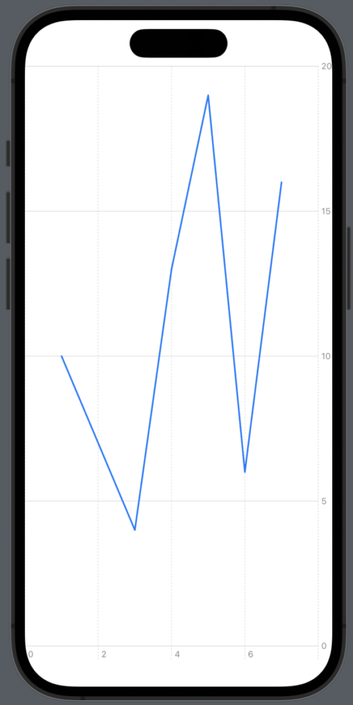
We will start by creating a struct called Order that contains three properties: id, amount and day. Next we will create a array and populate that with different orders. Last we will create the line graph:
struct Order: Identifiable {
    var id: String = UUID().uuidString
    var amount: Int
    var day: Int
}
import SwiftUI
import Charts
struct ChartsExampleView: View {
var orders: [Order] = [
Order(amount: 10, day: 1),
Order(amount: 7, day: 2),
Order(amount: 4, day: 3),
Order(amount: 13, day: 4),
Order(amount: 19, day: 5),
Order(amount: 6, day: 6),
Order(amount: 16, day: 7)
]
var body: some View {
Chart {
ForEach(orders) { order in
LineMark(
x: PlottableValue.value("Month", order.day),
y: PlottableValue.value("Orders", order.amount)
)
}
}
}
}The result:
SwiftUI charts line color
One of the more basic settings to alter is properly the color of the line chart — luckily it’s very easy and you can achieve this by using .foregroundColor on LineMark.
Now let’s make the line red instead of blue:
import SwiftUI
import Charts

struct ChartsExampleView: View {
    var orders: [Order] = [
        Order(amount: 10, day: 1),
        Order(amount: 7, day: 2),
        Order(amount: 4, day: 3),
        Order(amount: 13, day: 4),
        Order(amount: 19, day: 5),
        Order(amount: 6, day: 6),
        Order(amount: 16, day: 7)
    ]

    var body: some View {
        Chart {

            ForEach(orders) { order in
                LineMark(
                    x: PlottableValue.value("Month", order.day),
                    y: PlottableValue.value("Orders", order.amount)
                )
                .foregroundStyle(Color.red)
            }
        }
    }
}
The result:

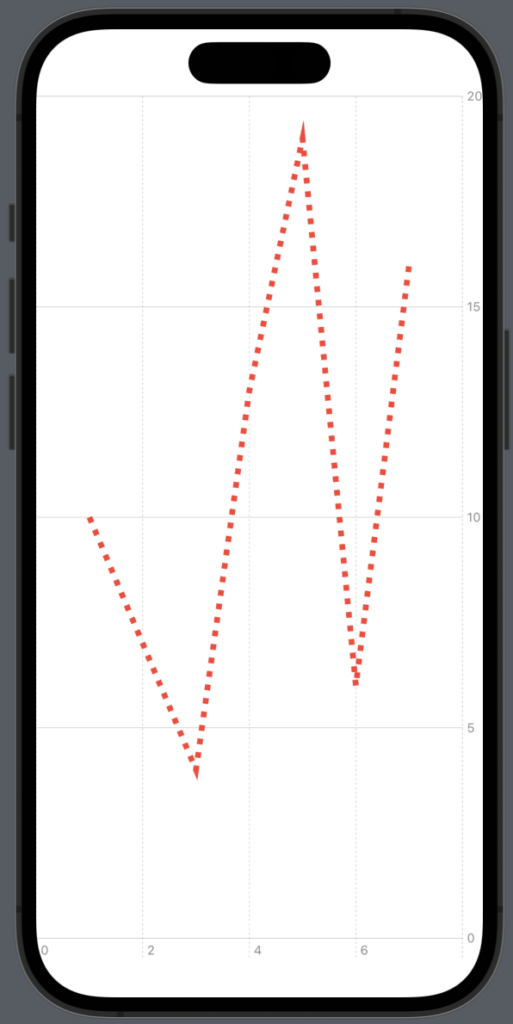
Let’s style the lines
Now it’s time to style the lines in our graph. There are different styles we can choose and you can customise your charts a lot — which is awesome!
Make the line thicker
The first style we will make is to make the line a bit thicker. We do that by adding .lineStyle to the graph and set it to 5:
var body: some View {
    Chart {
        ForEach(ordersWeekOne, id: \.id) { order in
            LineMark(
                x: PlottableValue.value("Week 1", order.day),
                y: PlottableValue.value("Orders 1", order.amount),
                series: .value("Week", "One")
            )
            .foregroundStyle(Color.red)
            .lineStyle(.init(lineWidth: 5))
        }
    }
}
The result:

Make the line dash
The next style we will try out is to make the line dash insead of full. We will do that by using the dash parameter in the init method:
var body: some View {
    Chart {
        ForEach(ordersWeekOne, id: \.id) { order in
            LineMark(
                x: PlottableValue.value("Week 1", order.day),
                y: PlottableValue.value("Orders 1", order.amount),
                series: .value("Week", "One")
            )
            .foregroundStyle(Color.red)
            .lineStyle(.init(lineWidth: 5, dash: [5,7]))
        }
    }
}
The result:
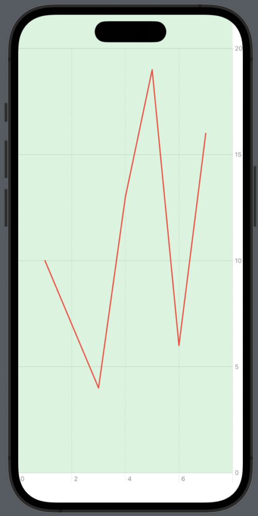
Change the background in the plot area
If you want to customize the plot area of your graph, you can easily do that by using the .chartPlotStyle modifier on the Chart.
In the following example we will make the background of the area green and set opacity to 0.2, so it doesn’t feel too heavy.
var body: some View {
    Chart {
        ForEach(ordersWeekOne, id: \.id) { order in
            LineMark(
                x: PlottableValue.value("Week 1", order.day),
                y: PlottableValue.value("Orders 1", order.amount),
                series: .value("Week", "One")
            )
            .foregroundStyle(Color.red)
            .chartPlotStyle { area in
                area.background(.green.opacity(0.2))
            }
        }
    }
}
The result:
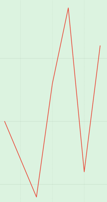
SwiftUI Line chart: Customising the curve
To customise the line curve you want to use .interpolationMethod modifier on the LineMark.
There are many different types of line curves and in the following sections you will learn the different types.
Interpolation cardinal
Interpolate data points with cardinal spline.
LineMark(
    x: PlottableValue.value("Week 1", order.day),
    y: PlottableValue.value("Orders 1", order.amount),
    series: .value("Week", "One")
)
.interpolationMethod(.cardinal)
The result:

Interpolation linear
Interpolate data points linearly.
LineMark(
    x: PlottableValue.value("Week 1", order.day),
    y: PlottableValue.value("Orders 1", order.amount),
    series: .value("Week", "One")
)
.interpolationMethod(.linear)
The result:
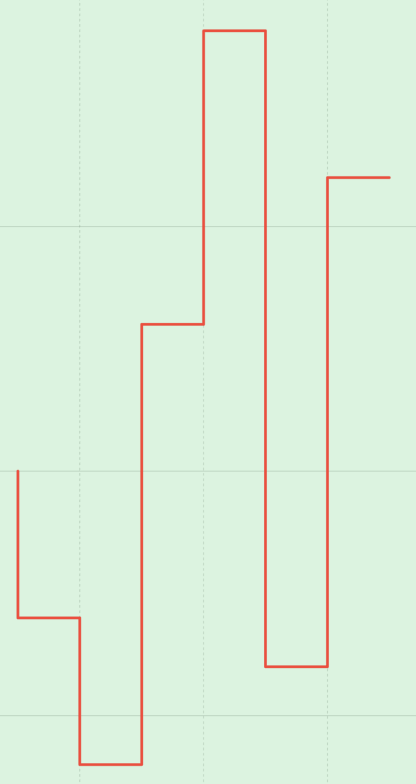
Interpolation stepStart
Interpolate data points with a step, or piece-wise constant function, where the data point is at the start of the step.
LineMark(
    x: PlottableValue.value("Week 1", order.day),
    y: PlottableValue.value("Orders 1", order.amount),
    series: .value("Week", "One")
)
.interpolationMethod(.stepStart)
The result:
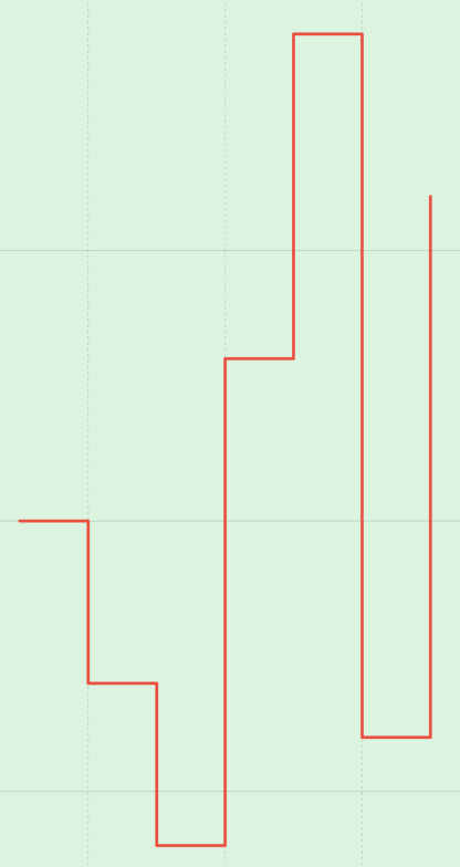
Interpolation stepEnd
Interpolate data points with a step, or piece-wise constant function, where the data point is at the end of the step.
LineMark(
    x: PlottableValue.value("Week 1", order.day),
    y: PlottableValue.value("Orders 1", order.amount),
    series: .value("Week", "One")
)
.interpolationMethod(.stepEnd)
The result:
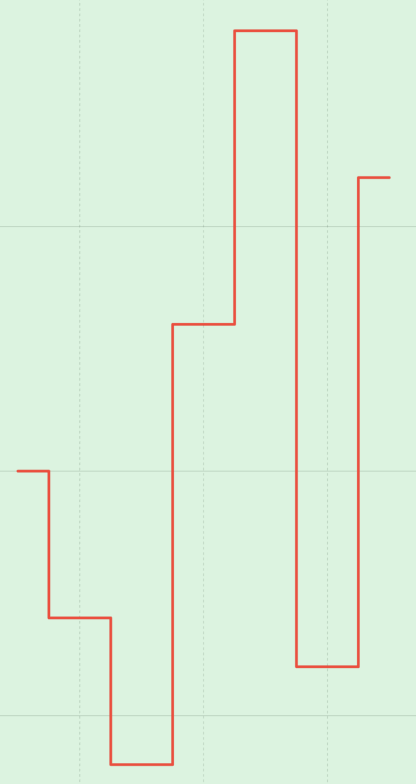
Interpolation stepCenter
Interpolate data points with a step, or piece-wise constant function, where the data point is at the center of the step.
LineMark(
    x: PlottableValue.value("Week 1", order.day),
    y: PlottableValue.value("Orders 1", order.amount),
    series: .value("Week", "One")
)
.interpolationMethod(.stepCenter)
The result:
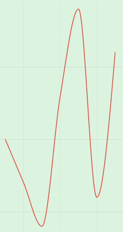
Interpolation monotone
Interpolate data points with a cubic spline that preserves monotonicity of the data.
LineMark(
    x: PlottableValue.value("Week 1", order.day),
    y: PlottableValue.value("Orders 1", order.amount),
    series: .value("Week", "One")
)
.interpolationMethod(.monotone)
The result:
Interpolation catmullRom
Interpolate data points with Catmull-Rom spline.
LineMark(
    x: PlottableValue.value("Week 1", order.day),
    y: PlottableValue.value("Orders 1", order.amount),
    series: .value("Week", "One")
)
.interpolationMethod(.catmullRom)
The result:
Symbol at every entry on the graph
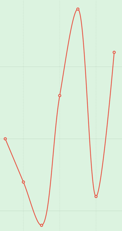
If you want to mark every plot entry on the graph with a circle, or something else, then you can use the .symbol modifier on the LineMark. There are many different types of mark you can chose from, so you can get the one that fits best in your app
In the following we will be adding a circle to every entry point.
LineMark(
    x: PlottableValue.value("Week 1", order.day),
    y: PlottableValue.value("Orders 1", order.amount),
    series: .value("Week", "One")
)
.symbol(.circle)
The result:

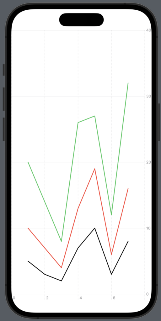
SwiftUI Line chart multiline
One of the great options when using the line chart is that it’s visualy easy to compare different datasets.
There is a few ways of creating a multiline line chart and now you will learn the most easy of them — and properly the best one becaurese it’s easy for you as a developer to undersatand it and it’s easy for another developer to work with.
In the following example we will create a line chart with 3 lines. So first create two datasets more, add them to the graph and add a series to each line graph:
import SwiftUI
import Charts

struct ChartsExampleView: View {
    var ordersWeekOne: [Order] = [
        Order(amount: 10, day: 1),
        Order(amount: 7, day: 2),
        Order(amount: 4, day: 3),
        Order(amount: 13, day: 4),
        Order(amount: 19, day: 5),
        Order(amount: 6, day: 6),
        Order(amount: 16, day: 7)
    ]
    var ordersWeekTwo: [Order] = [
        Order(amount: 20, day: 1),
        Order(amount: 14, day: 2),
        Order(amount: 8, day: 3),
        Order(amount: 26, day: 4),
        Order(amount: 27, day: 5),
        Order(amount: 12, day: 6),
        Order(amount: 32, day: 7)
    ]
    var ordersWeekThree: [Order] = [
        Order(amount: 5, day: 1),
        Order(amount: 3, day: 2),
        Order(amount: 2, day: 3),
        Order(amount: 7, day: 4),
        Order(amount: 10, day: 5),
        Order(amount: 3, day: 6),
        Order(amount: 8, day: 7)
    ]

    var body: some View {
        Chart {
            ForEach(ordersWeekOne, id: \.id) { order in
                LineMark(
                    x: PlottableValue.value("Week 1", order.day),
                    y: PlottableValue.value("Orders 1", order.amount),
                    series: .value("Week", "One")
                )
                .foregroundStyle(Color.red)
            }

            ForEach(ordersWeekTwo, id: \.id) { order in
                LineMark(
                    x: PlottableValue.value("Week 2", order.day),
                    y: PlottableValue.value("Orders 2", order.amount)
                    ,
                    series: .value("Week", "Two")
                )
                .foregroundStyle(Color.green)
            }

            ForEach(ordersWeekThree, id: \.id) { order in
                LineMark(
                    x: PlottableValue.value("Week 3", order.day),
                    y: PlottableValue.value("Orders 3", order.amount)
                    ,
                    series: .value("Week", "Three")
                )
                .foregroundStyle(Color.black)
            }
        }
    }
}
The result:
Wrap up SwiftUI Line chart
In wrapping up our exploration of SwiftUI Line Charts, it’s clear that this feature empowers developers to deliver exceptional user experiences through data visualization. We have covered a lot of things like how to make a line chart, how to change the color and how to create multiple lines in one chart.
I hope you have enjoyed the article and found it helpful — happy coding 🙂