When you want to create a blurred background, you should differently use SwiftUI material. Material was launched in SwiftUI 3 and is a great way of making a blurred background or see through view, Apple has provided an easy way of making a blur effect as a background.
In this blog post, you will learn what Material is and how you use it and we will create an example with a view where we use material.
SwiftUI Material examples
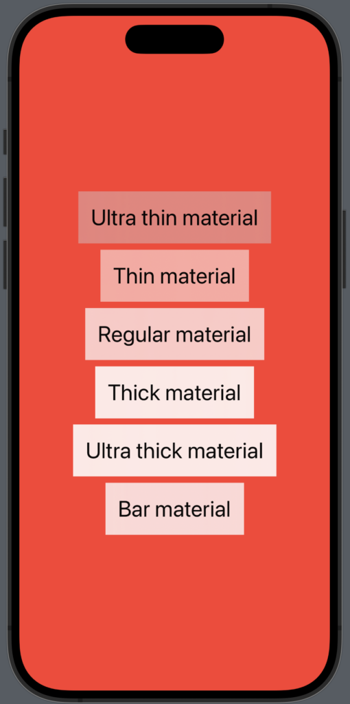
Apple has provided 6 build materials you can use: ultraThin, thin, regular, thick, ultraThick and bar. The first five make sense just by reading the title, but bar might not make sense, but bar is a material that matches the style of system toolbars.
NB: Material works both in dark and light mode.
In the following example you can see the six different materials:
import SwiftUI

struct BlurView: View {
    var body: some View {
        VStack {
            Text("Ultra thin material")
                .font(.title)
                .padding()
                .background(.ultraThinMaterial)

            Text("Thin material")
                .font(.title)
                .padding()
                .background(.thinMaterial)

            Text("Regular material")
                .font(.title)
                .padding()
                .background(.regularMaterial)

            Text("Thick material")
                .font(.title)
                .padding()
                .background(.thickMaterial)

            Text("Ultra thick material")
                .font(.title)
                .padding()
                .background(.ultraThickMaterial)

            Text("Bar material")
                .font(.title)
                .padding()
                .background(.bar)
        }
        .frame(maxWidth: .infinity, maxHeight: .infinity)
        .background(Color.red)
    }
}
The result:
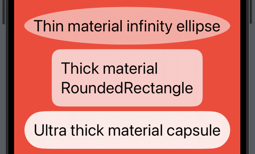
Material works with shapes
Material is also shapeable, which means that you can for example easily make rounded corners and still have your blur effect.
In the following example, we create 3 different text elements with material and a shape:
import SwiftUI

struct BlurView: View {
    var body: some View {
        VStack {
            Text("Thin material infinity ellipse")
                .font(.title)
                .padding()
                .background(.thinMaterial, in: .ellipse)

            Text("Thick material RoundedRectangle")
                .font(.title)
                .padding()
                .background(.regularMaterial, in: RoundedRectangle(cornerRadius: 15.0))

            Text("Ultra thick material capsule")
                .font(.title)
                .padding()
                .background(.ultraThickMaterial, in: .capsule)
        }
        .frame(maxWidth: .infinity, maxHeight: .infinity)
        .background(Color.red)
    }
}
The result:
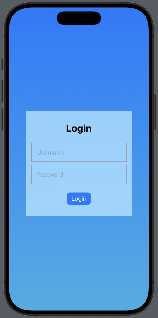
Material use case
One great place to use material is when you want to build a view where you have a form you want to highlight and make the users focus on. With Material a highlighted view looks like it fits a bit more in the design.
In the following example, we have a login form inside a a VStack with .thinMaterial set as background:
import SwiftUI

struct MaterialView: View {
    @State var userName: String = ""
    @State var password: String = ""

    var body: some View {
        ZStack {
            LinearGradient(
                gradient: .init(colors: [.blue, .cyan]),
                startPoint: .top,
                endPoint: .bottom
            )
            .ignoresSafeArea()

            VStack {

                Text("Login")
                    .padding()
                    .font(.title)
                    .bold()

                TextField("Username", text: $userName)
                    .padding()
                    .border(.gray)

                TextField("Password", text: $password)
                    .padding()
                    .border(.gray)

                Button {
                    print("Login time!")
                }label: {
                    Text("Login")
                }
                .padding()
                .buttonStyle(
                    .borderedProminent
                )
            }
            .padding()
            .frame(width: 300)
            .background(
                .thinMaterial,
                in: RoundedRectangle(cornerRadius: 2.0)
            )
        }
    }
}
The result:
Wrap up SwiftUI Material
Material is a great way of adding blur effect to an entire view or just part of a view.
In this short blog post, we learned the different material that exists and created a login view where we used Material. I hope you can use this in your next application 🙂