The Picker is a powerful and versatile user interface component in SwiftUI that allows users to select an option from a predefined list. In this blog post, we will explore the capabilities of the SwiftUI Picker and how you can leverage its features to enhance your app’s user experience.
SwiftUI Picker simple example
Let’s start things off with a simple example — start by creating a new project and do the following:
- Create a State var called selectedOption that is a string and a let options witch is an array of strings.
- Next create a VStack and inside that VStack we will create the Picker and two Text elements that shows that option you have chosen.
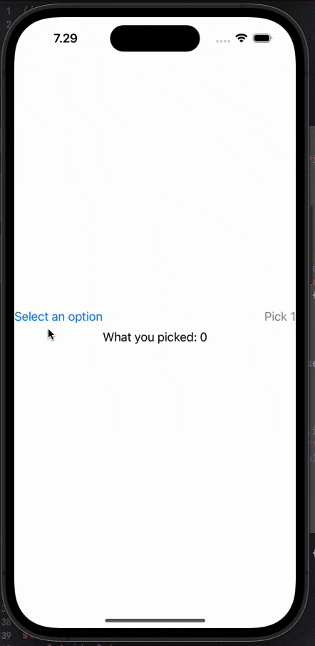
struct PickerContent: View {
    @State var selectedOption: String = "Pick 1"
    let options = ["Pick 1", "Pick 2", "Pick 3", "Pick 4"]

    var body: some View {
        VStack {
            Picker(selection: $selectedOption, label: Text("Select an option")) {
                ForEach(options, id: \.self) { option in
                    Text(option)
                }
            }
            Text("What you picked:")
            Text(selectedOption)
                .foregroundColor(Color.purple)
                .bold()
        }
    }
}
The above code will produce the following result:

Picker example with objects
The simple example above is great in many situations, but sometimes you want your picker to use objects. Let’s say you get the picker options from an API and need the ID from the chosen object to send to the API, but need the name to show to your users.
We will use the example above and convert it into using objects.
- Create a struct called PickerObject with an id and name.
- Next change the selectedOption to be an Int and change the options to be an array of PickerObject’s instead of strings
- Now our selectedOption is the id of the object you chose in the list and therefore you can change the last Text element to fetch the object with the chosen id.
struct PickerObject {
    let id: Int
    let name: String
}

struct PickerContent: View {
    @State var selectedOption: Int = 0
    let options = [PickerObject(id: 3, name: "Pick 1"), PickerObject(id: 5, name: "Pick 2"), PickerObject(id: 8, name: "Pick 3"), PickerObject(id: 10, name: "Pick 4")]

    var body: some View {
        VStack {
            Picker(selection: $selectedOption, label: Text("Select an option")) {
                ForEach(options, id: \.id) { option in
                    Text(option.name)
                }
            }
            Text("What you picked: \(selectedOption)")
            Text(options.first(where: { $0.id == selectedOption})?.name ?? "")
                .foregroundColor(Color.purple)
                .bold()
        }
    }
}
The code above will produce the following result:

SwiftUI picker style
SwiftUI Picker offers several styles to customize its appearance and adapt it to your app’s design. Choosing the appropriate style for your Picker, you can create a visually appealing and intuitive user interface for selecting options.
Default Picker style
The default style for SwiftUI Picker depends on the platform and device you’re using. It provides a native look and feel, ensuring consistency across Apple devices.
To get the basic default style you don’t really need to do anything but create a picker, but if you really want to add the style simply add the following modifier:
.pickerStyle(DefaultPickerStyle())Segmented Picker style
The segmented style displays the options as a segmented control, where users can choose a single option from the available choices and your user doesn’t need to click to open the options. This style is particularly useful when you have a limited number of options — i would say 5 is the maximum but play around with it.
.pickerStyle(SegmentedPickerStyle())The result:

Wheel Picker style
The wheel style presents the options in a spinning wheel-like interface, where users can swipe or rotate to select their desired option. This style is commonly used for large sets of options and you might recognize it from the native clock app where you chose alarm time.
.pickerStyle(WheelPickerStyle())The result:

Inline Picker style
The inline style embeds the picker directly into the view hierarchy, seamlessly blending with the surrounding content. It provides a compact and visually appealing way to present options and is properly what you want to choose if you for example have a picker in a form.
.pickerStyle(InlinePickerStyle())Menu Picker style
As of iOS 16 and above the default picker style is the Menu, so you don’t really need to use that, but if you are working on a app the needs to support below iOS 16, then it’s nice to know it exists.
The menu style displays the options as a pop-up menu, allowing users to select an option from a dropdown-style list. This style is useful when you want to conserve space on the screen.
.pickerStyle(MenuPickerStyle())Navigation link style
The last style is called NavigationLinkPickerStyle and is a great option if you are creating a app for iOS 16 and above.
The navigation link style shows the options of the picker in a new view, all you need to do is implement your picker in a NavigationStack and add the NavigationLinkPickerStyle()
struct PickerContent: View {
    @State var selectedOption: Int = 0
    let options = [PickerObject(id: 3, name: "Pick 1"), PickerObject(id: 5, name: "Pick 2"), PickerObject(id: 8, name: "Pick 3"), PickerObject(id: 10, name: "Pick 4")]

    var body: some View {
        NavigationStack { //<--- 1. Add this
            VStack {
                Picker(selection: $selectedOption, label: Text("Select an option")) {
                    ForEach(options, id: \.id) { option in
                        Text(option.name)
                    }
                }
                .pickerStyle(NavigationLinkPickerStyle()) //<--- 2. Add this

                Text("What you picked: \(selectedOption)")
                Text(options.first(where: { $0.id == selectedOption})?.name ?? "")
                    .foregroundColor(Color.purple)
                    .bold()
            }
        }
    }
}
The result:
Conclusion
Using the SwiftUI Picker simplifies the process of creating selection-based user interfaces, providing a consistent and customizable experience for your app users. Its native integration with SwiftUI and its flexibility make it a powerful tool in building user-friendly interfaces.
A few points on why it’s a good idea to use SwiftUI picker:
- Native SwiftUI Component: The
Pickeris a native SwiftUI component, which means it is built using SwiftUI’s declarative syntax and integrates seamlessly with other SwiftUI views and controls. - Consistent User Interface: The
Pickerprovides a consistent user interface across different Apple platforms, such as iOS, macOS, watchOS, and tvOS. This allows you to create a unified user experience for your app. - Dynamic Updates: As the user interacts with the
Picker, selecting different options, the view automatically updates to reflect the current selection. This dynamic behavior enhances the user experience and eliminates the need for manual handling of selection changes.