As developers, we strive to create applications that are easy to use and visually appealing. Part of achieving this goal is incorporating a user interface that provides clear feedback to the user about the state of the application. One way to achieve this is through the use of progress indicators. In SwiftUI, we have the ProgressView, a view that displays the progress of a task or process. In this post, we’ll explore what ProgressView is, how to use it, and why it’s a good idea.
What is ProgressView?
ProgressView is a SwiftUI view that shows the progress of a task or process. It provides a visual representation of how much progress has been made and how much is left to be completed. ProgressView can be used to show the progress of various tasks such as downloading a file, uploading an image, or processing data. It is a useful tool that can help users understand what is happening in the application and how much longer they need to wait before the task is complete.
How to use ProgressView
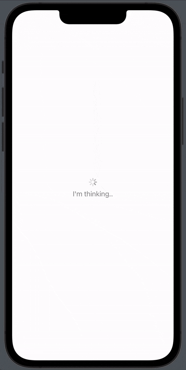
Using ProgressView in your SwiftUI application is easy. You simply need to create an instance of ProgressView and set its properties. Here’s an example of how to create a basic ProgressView:
import SwiftUI

struct ContentView: View {
    var body: some View {
        ProgressView("I'm thinking..")
    }
}
Which will produce the following result:
SwiftUI progressview color
There is not a lot you need to customize when it comes to ProgressView, but something you often want to change is the color.
If you want to change to color for the spinner you want to use the .tint modifier and if you want to change the text color you want to use the .foregroundColor modifier.
ProgressView("I'm thinking..")
            .tint(.red)
            .foregroundColor(.blue)
Which will produce the following result:

SwiftUI progressview style
ProgressView has several styles that can be used to customize its appearance. Here are some of the styles available:
DefaultProgressViewStyle: This is the default style, which displays a circular progress bar.LinearProgressViewStyle: This style displays a horizontal progress bar with rounded corners.CircularProgressViewStyle: This style displays a circular progress bar with a fill color that can be customized.DeterminateCircularProgressViewStyle: This style displays a circular progress bar with a fill color that progresses over time.TintedCircularProgressViewStyle: This style displays a circular progress bar with a tint color that can be customized.GradientCircularProgressViewStyle: This style displays a circular progress bar with a gradient fill that can be customized.SimpleProgressViewStyle: This style displays a horizontal progress bar with no additional decorations.
SwiftUI progress view size
SwiftUI progress bar
If you want to create a progress bar you can still use the ProgressView.
To style your ProgressView you can use the .progressViewStyle modifier and if you want to create a progress bar you want to use the LinearProgressViewStyle, set a value and a total value:
struct ContentView: View {
    @State var value : Float = 25

    var body: some View {
        ProgressView("I'm thinking..", value: value, total: 100)
            .tint(.red)
            .foregroundColor(.blue)
            .progressViewStyle(LinearProgressViewStyle())
    }
}
Which will produce the following result:

Why use ProgressView?
ProgressView is a powerful tool that can enhance the user experience in SwiftUI applications. Here are some of the main reasons why you should consider using ProgressView in your SwiftUI app:
- Improved User Experience: Users want to know what is happening in the app and how long they need to wait for a task to be completed. By incorporating ProgressView, you can provide users with a visual representation of the progress of a task. This can help reduce frustration and anxiety caused by waiting for a task to complete.
- Easy to Use: ProgressView is easy to use and can be implemented with just a few lines of code. You simply need to create an instance of ProgressView and set its properties.
- Customizable: ProgressView can be customized to match the style of your app. SwiftUI provides several built-in styles such as CircularProgressViewStyle and LinearProgressViewStyle, or you can create your own custom style.
- Accessibility: ProgressView is accessible to users with disabilities. SwiftUI provides built-in support for accessibility features such as VoiceOver and Dynamic Type.
- Visual Appeal: ProgressView can make your app more visually appealing by providing a visual representation of the progress of a task. This can help make your app more engaging and enjoyable to use.
Overall, ProgressView is a valuable tool that can enhance the user experience in your SwiftUI application. It provides users with clear feedback about the state of the app and can help reduce frustration caused by waiting for tasks to complete. Additionally, ProgressView is easy to use and can be customized to match the style of your app. By incorporating ProgressView into your SwiftUI app, you can create a more engaging and enjoyable user experience.