SwiftUI Segmented Control is a great and user-friendly way that allows users to choose between multiple options within a segmented, tap-friendly control.
In this blog post, we’ll learn how to create a Segmented Control in SwiftUI and explore how to change the selected color and background color.
How do I create a segment control in SwiftUI?
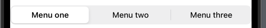
At its core, a segmented control is just a SwiftUI Picker with the picker style SegmentedPickerStyle. So to create a segmented control create a Picker and then add the modifier .pickerStyle with .segmented.
In the following example we will create a segmented control with three buttons:
import SwiftUI

struct SegmentedControlView: View {
    @State var selection = 0
    var body: some View {

        Picker(selection: $selection, label: Text("test")) {
            Text("Menu one").tag(0)
            Text("Menu two").tag(1)
            Text("Menu three").tag(2)
        }
        .pickerStyle(.segmented)
    }
}
The result:
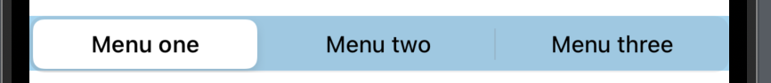
SwiftUI segmented control selected color
One thing many want to change right away is the selected color of the segmented control. It’s pretty straightforward to change the selected color, just use the .colorMultiply modifier.
In the following example, we will change the selected color to brown:
import SwiftUI

struct SegmentedControlView: View {
    @State var selection = 0
    var body: some View {

        Picker(selection: $selection, label: Text("test")) {
            Text("Menu one").tag(0)
            Text("Menu two").tag(1)
            Text("Menu three").tag(2)
        }
        .pickerStyle(.segmented)
        .colorMultiply(.brown)
    }
}
The result:

SwiftUI segmented control background color
Now we have changed the selected color of our segmented control — now it’s time to change the background color.
We simply use the .background modifier to set the background color — a little tip is to use .opacity on the chosen color, it makes the color a bit more easy on the eyes.
In the following example, we will create a segmented control with the background color cyan with an opacity of 0.5:
import SwiftUI

struct SegmentedControlView: View {
    @State var selection = 0
    var body: some View {

        Picker(selection: $selection, label: Text("test")) {
            Text("Menu one").tag(0)
            Text("Menu two").tag(1)
            Text("Menu three").tag(2)
        }
        .pickerStyle(.segmented)
        .background(.cyan.opacity(0.5))
    }
}
The result:
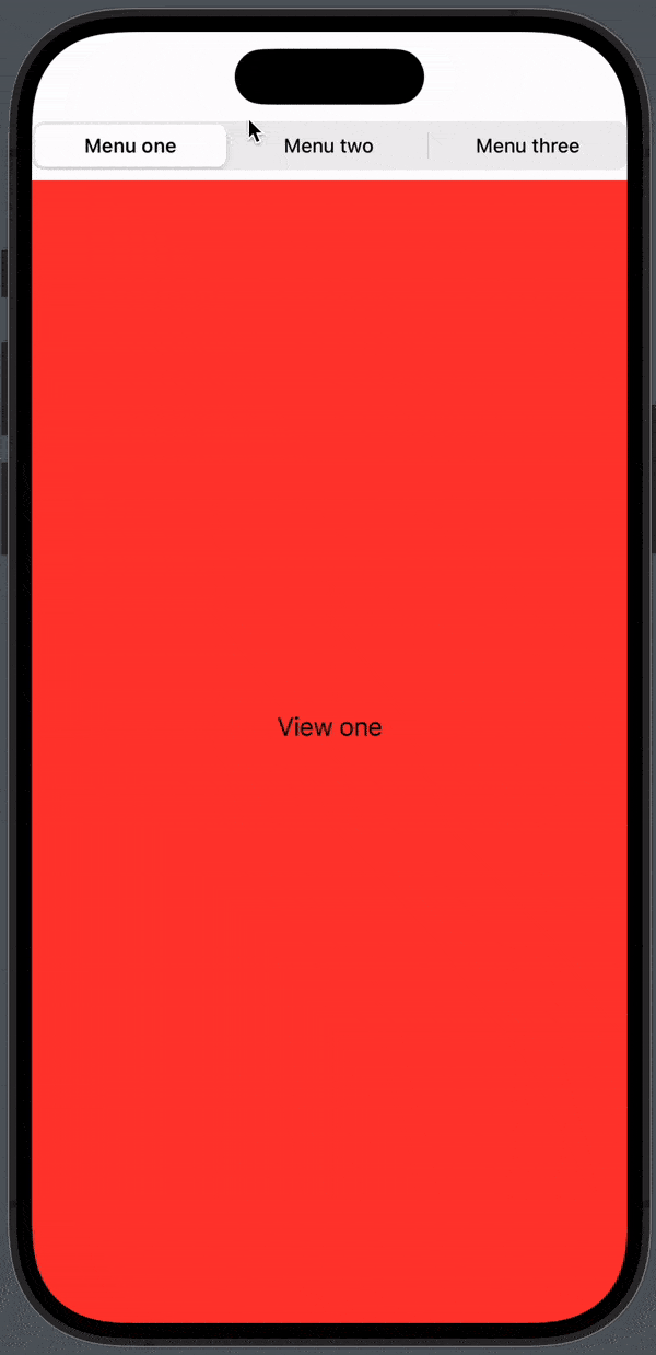
SwiftUI segmented control change view
To navigate to a new view using segment control is properly one of the most common use cases.
In the following example, we will create three different views and we will make a segment that can navigate to the views. The segment will be at the top of the views.
Firstly we will create the following views:
struct ViewOne: View {
    var body: some View {
        VStack {
            Text("View one")
        }
        .frame(
            maxWidth: .infinity,
            maxHeight: .infinity)
        .background(Color.red)
    }
}

struct ViewTwo: View {
    var body: some View {
        VStack {
            Text("View two")
        }
        .frame(
            maxWidth: .infinity,
            maxHeight: .infinity)
        .background(Color.blue)
    }
}

struct ViewThree: View {
    var body: some View {
        VStack {
            Text("View three")
        }
        .frame(
            maxWidth: .infinity,
            maxHeight: .infinity)
        .background(Color.cyan)
    }
}
Next, we will create a switch statement that changes views based on the selected segment value:
import SwiftUI

struct SegmentedControlView: View {
    @State var selection = 0
    var body: some View {

        Picker(selection: $selection, label: Text("test")) {
            Text("Menu one").tag(0)
            Text("Menu two").tag(1)
            Text("Menu three").tag(2)
        }
        .pickerStyle(.segmented)

        switch selection {
        case 0:
            ViewOne()
        case 1:
            ViewTwo()
        case 2:
            ViewThree()
        default:
            ViewOne()
        }
    }
}
The result:
Wrap up segment control in SwiftUI
Segmented controls are a great way to craft intuitive and efficient user interfaces in SwiftUI. Whether you’re building a simple settings screen or a complex navigation system, segmented controls provide a convenient way for users to toggle between options and navigate through your app’s content.
In this blog post, we learned how to create a segment control and change the colors. We also covered a way to change the view based on the selected segment.
I hope you enjoyed the article — happy coding 🙂