SwiftUI Toolbar is a powerful tool for designing elegant and functional user interfaces. In this blog post, we’ll be working with the native SwiftUI Toolbar and exploring its capabilities, providing examples, and showing you how to customize things like its background color to match your app’s design.
SwiftUI toolbar basic example
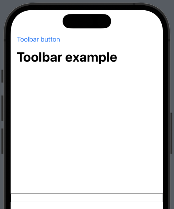
Let’s kick things off by creating a basic example on how to implement a toolbar and adding one button that create a simple print.
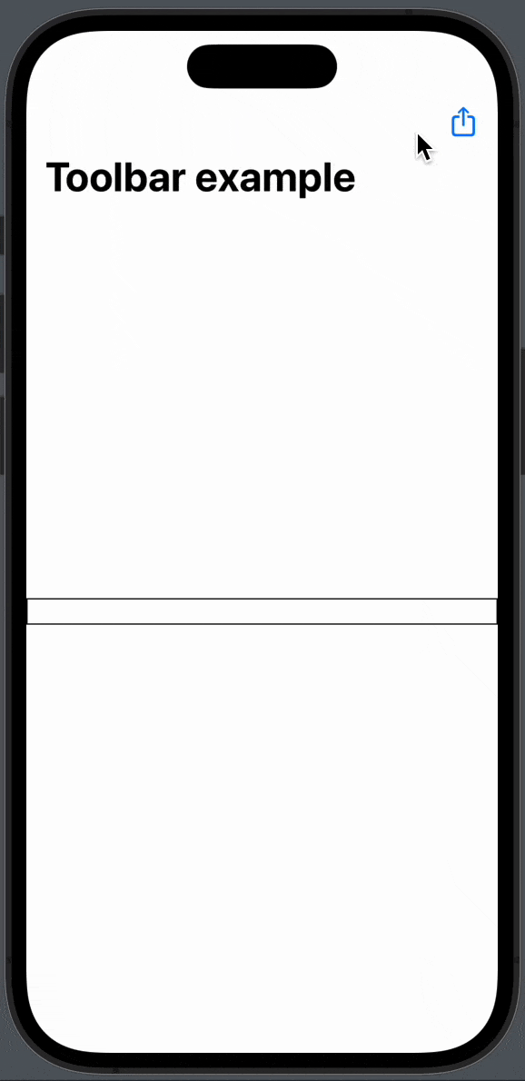
In order for us to use the native toolbar, we need to create a NavigationView.
Inside the NavigationView we will add a TextField and on the TextField we will use the .toolbar modifier. In the toolbar we’ll create a button that prints to the console:
import SwiftUI

struct ToolbarExampleView: View {
    @State private var text = ""

    var body: some View {
        NavigationView {
            TextField("", text: $text) {
            }
            .border(.black)
            .navigationTitle("Toolbar example")
            .toolbar {
                ToolbarItem(placement: .navigation) {
                    Button {
                        print("Toolbar button pressed")
                    }label: {
                        Text("Toolbar button")
                    }
                }
            }
        }
    }
}
The result:
SwiftUI toolbar placement
SwiftUI toolbar placement within your app’s interface is important and luckily Apple have thought of that when they made the toolbar modifier.
There are sevel build in placement’s you can use. Let’s go though the most common use cases.
Toolbar placement: Top left
To place the toolbar in the top left corner, you want to use the .navigationBarLeading:
.toolbar {
    ToolbarItem(placement: .navigationBarLeading) {
        Button {
            print("Toolbar button pressed")
        }label: {
            Text("Toolbar button")
        }
    }
}
The result:

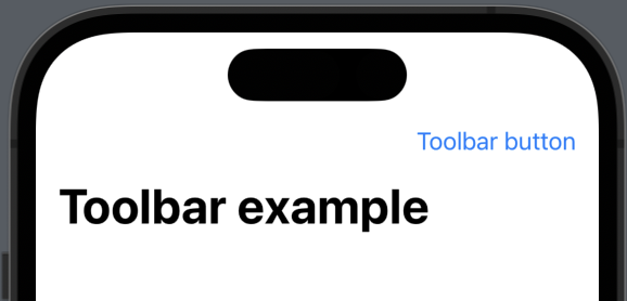
Toolbar placement: Top right
To place the toolbar in the top right corner, you want to use the .navigationBarTrailing:
.toolbar {
    ToolbarItem(placement: .navigationBarTrailing) {
        Button {
            print("Toolbar button pressed")
        }label: {
            Text("Toolbar button")
        }
    }
}
The result:
Toolbar placement: Bottom
To place the toolbar at the bottom, you want to use the .bottomBar:
.toolbar {
    ToolbarItem(placement: .bottomBar) {
        Button {
            print("Toolbar button pressed")
        }label: {
            Text("Toolbar button")
        }
    }
}
The result:
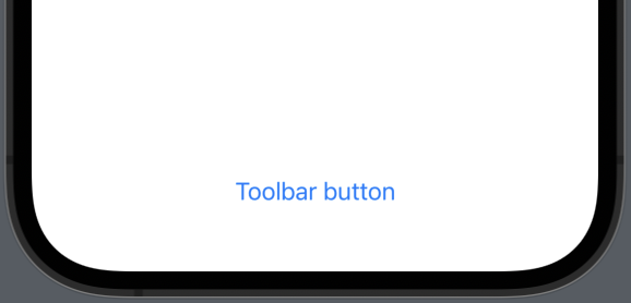
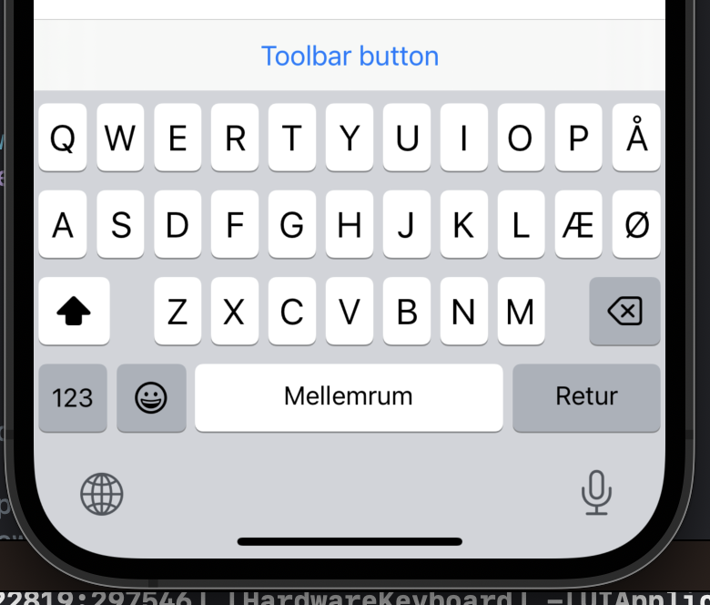
Toolbar placement: keyboard
To place the toolbar on top of a active keyboard then you want to use .keyboard.’
.toolbar {
    ToolbarItem(placement: .keyboard) {
        Button {
            print("Toolbar button pressed")
        }label: {
            Text("Toolbar button")
        }
    }
}
The result:
SwiftUI toolbar in sheet
When you are presenting a sheet you might want some controls at the top, that doesn’t get in the way and feels natural.
You can easily achieve that by using a toolbar inside you sheet and use .confirmationAction, .destructiveAction or .cancellationAction.
In the following example we will show a sheet and place three buttons at the top:
struct ToolbarExampleView: View {
    @State private var text = ""
    @State var showSheet: Bool = false

    var body: some View {
        NavigationView {
            TextField("", text: $text) {
            }
            .border(.black)
            .navigationTitle("Toolbar example")
            .sheet(isPresented: $showSheet) {
                NavigationView {
                    Text("You are in sheet now.")
                        .toolbar {
                            ToolbarItem(placement: .confirmationAction) {
                                Button("Confirm", action: {})
                            }
                            ToolbarItem(placement: .destructiveAction) {
                                Button("Delete", action: {})
                            }
                            ToolbarItem(placement: .cancellationAction) {
                                Button("Cancel", action: {})
                            }
                        }
                }
            }
            .toolbar {
                ToolbarItem(placement: .confirmationAction) {
                    Button {
                        showSheet.toggle()
                    }label: {
                        Image(systemName: "square.and.arrow.up")
                    }

                }
            }
        }
    }
}
The result:
Toolbar background color in SwiftUI
To change the background color of your toolbar is essential. Most of the time the default colors is great, but if you want to build something unique, then you definitely want to be able to change the background color in your toolbar.
In order to change the background color we need to use two .toolbarBackground: One the sets the color and one that set the background to visible.
import SwiftUI

struct ToolbarExampleView: View {
    @State private var text = ""

    var body: some View {
        NavigationView {
            TextField("", text: $text) {
            }
            .border(.black)
            .navigationTitle("Toolbar example")
            .toolbar {
                ToolbarItem(placement: .navigationBarLeading) {
                    Button {
                        print("Toolbar button pressed")
                    }label: {
                        Text("Toolbar button")
                    }
                }
            }
            .toolbarBackground(.green, for: .navigationBar) //<- Set background
            .toolbarBackground(.visible, for: .navigationBar) // <- Set visible
        }
    }
}
The result:

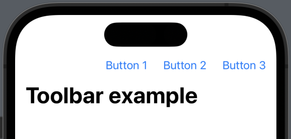
How do I add multiple buttons to the toolbar in SwiftUI?
If you want to add multiple buttons and group them together, you can do that by using the ToolbarItemGroup.
In the following example we will create three buttons in the same toolbar:
struct ToolbarExampleView: View {
    @State private var text = ""

    var body: some View {
        NavigationView {
            TextField("", text: $text) {
            }
            .border(.black)
            .navigationTitle("Toolbar example")
            .toolbar {
                ToolbarItemGroup(placement: .navigationBarTrailing) {
                    Button {
                        print("Toolbar button pressedddd")
                    }label: {
                        Text("Button 1")
                    }
                    Button {
                        print("Toolbar button pressed 2")
                    } label: {
                        Text("Button 2")
                    }

                    Button {
                        print("Toolbar button pressed 2")
                    } label: {
                        Text("Button 3")
                    }

                }
            }
        }
    }
}
The result:
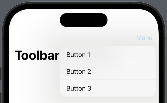
SwiftUI toolbar menu
When adding button to a toolbar it can quickly become a bit cluttered and doesn’t quite fit. In those cases you properly want to create a dropdown with the toolbar options.
You can achieve that by using Menu control. In the following we will create three buttons inside a menu:
struct ToolbarExampleView: View {
    @State private var text = ""

    var body: some View {
        NavigationView {
            TextField("", text: $text) {
            }
            .border(.black)
            .navigationTitle("Toolbar example")
            .toolbar {
                ToolbarItem(placement: .navigationBarTrailing) {
                    Menu {
                        Button {
                            print("Toolbar button pressedddd")
                        }label: {
                            Text("Button 1")
                        }
                        Button {
                            print("Toolbar button pressed 2")
                        } label: {
                            Text("Button 2")
                        }

                        Button {
                            print("Toolbar button pressed 2")
                        } label: {
                            Text("Button 3")
                        }
                    }label: {
                        Text("Menu")
                    }
                }
            }
        }
    }
}
The result:
Multiple toolbars in SwiftUi
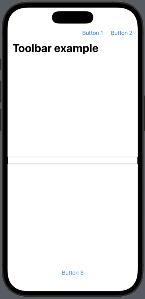
In some cases you might want to add two or more toolbars. For example let’s say you want a toolbar in the navigation view, at the bottom and when the keybord is showing. You can achrive just that by using different placementments.
In the following example we will make two toolbars: One at the top and one in the bottom:
struct ToolbarExampleView: View {
    @State private var text = ""

    var body: some View {
        NavigationView {
            TextField("", text: $text) {
            }
            .border(.black)
            .navigationTitle("Toolbar example")
            .toolbar {
                ToolbarItemGroup(placement: .navigationBarTrailing) {
                    Button {
                        print("Toolbar button pressedddd")
                    }label: {
                        Text("Button 1")
                    }
                    Button {
                        print("Toolbar button pressed 2")
                    } label: {
                        Text("Button 2")
                    }

                }
                ToolbarItemGroup(placement: .bottomBar) {
                    Button {
                        print("Toolbar button pressed 3")
                    } label: {
                        Text("Button 3")
                    }
                }
            }
        }
    }
}
The result:
SwiftUI toolbar with SF images
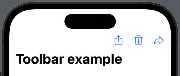
Often you want your toolbar items to be images the symbolises what the button does instead of using words, because if can take up quite a lot of space.
This is where SF symbols comes into the picture — they are ideal and really easy to use.
In the following example we will create three button in the toolbar with three different SF symbols.
struct ToolbarExampleView: View {
    @State private var text = ""

    var body: some View {
        NavigationView {
            TextField("", text: $text) {
            }
            .border(.black)
            .navigationTitle("Toolbar example")
            .toolbar {
                ToolbarItemGroup(placement: .navigationBarTrailing) {
                    Button {
                        print("Toolbar button pressedddd")
                    }label: {
                        Image(systemName: "square.and.arrow.up")
                    }
                    Button {
                        print("Toolbar button pressed 2")
                    } label: {
                        Image(systemName: "trash")
                    }
                    Button {
                        print("Toolbar button pressed 3")
                    }label: {
                        Image(systemName: "arrowshape.turn.up.forward")
                    }

                }
            }
        }
    }
}
The result: