SwiftUI DatePicker is a powerful tool that simplifies date and time selection in your iOS apps. The SwiftUI DatePicker provides a seamless way for users to choose dates and times within your app, eliminating the need for complex input forms or manual date entry. With a sleek and customizable interface, this component enhances the user experience and streamlines the development process.
In this blog post, you will learn how to use the DatePicker in SwiftUI and how to customize it so it fits right into the style of your application.
SwiftUI DatePicker example
Before we get all fancy let’s start with the most basic example of a DatePicker in SwiftUI.
In this example, we will create a @State variable that holds a Date object and we will create a DatePicker where you can choose a date and time:
import SwiftUI
struct DatePickerView: View {
@State var selectedDate: Date = Date()
var body: some View {
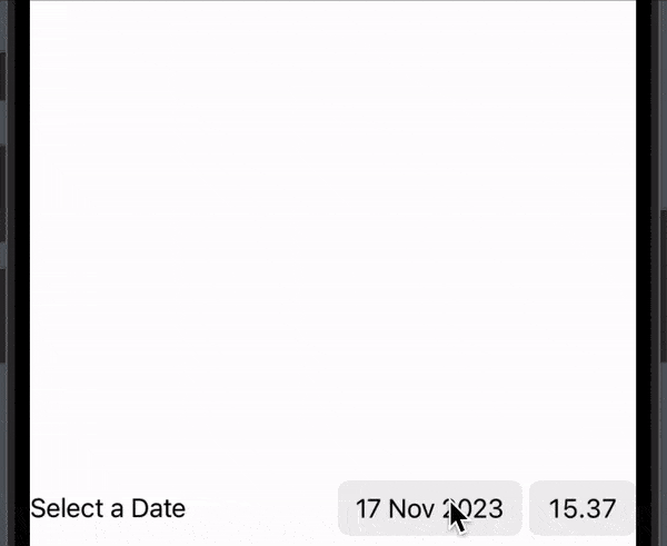
DatePicker("Select a Date",
selection: $selectedDate,
displayedComponents: [.date, .hourAndMinute]
)
}
}The result:
SwiftUI DatePicker style
By default, SwiftUI provides a few styles that we can use. Currently, there are 3 that we can use: .compact, .graphical, and wheel.
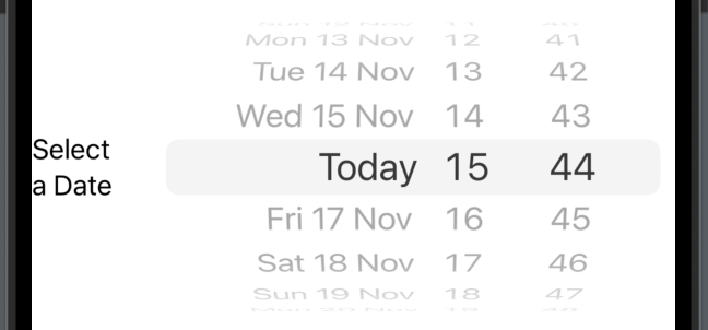
Datepicker wheel style
The first style we will cover is the wheel. The wheel style is sometimes also called the old style — because it’s how date and time were created when iOS was first introduced.
In the following example we will create a DatePicker with wheel style that displays both date and time:
DatePicker("Select a Date",
            selection: $selectedDate,
            displayedComponents: [.date, .hourAndMinute]
 )
 .datePickerStyle(.wheel)
The result:
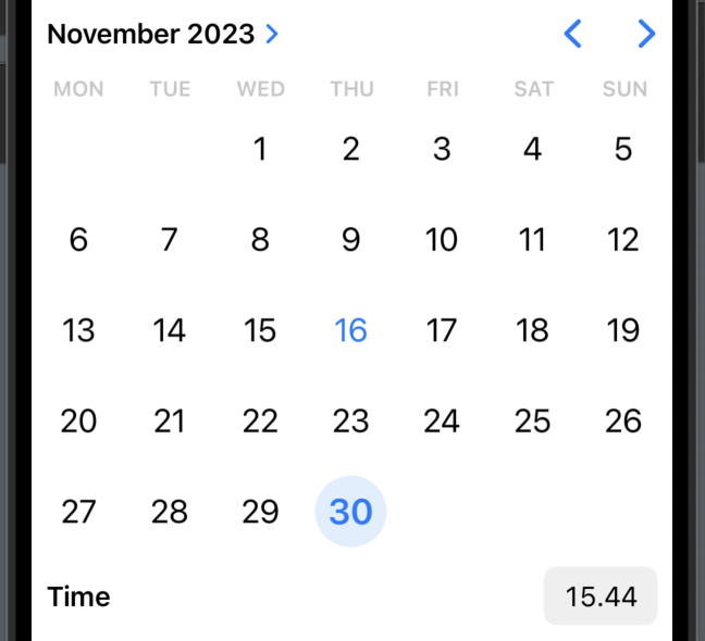
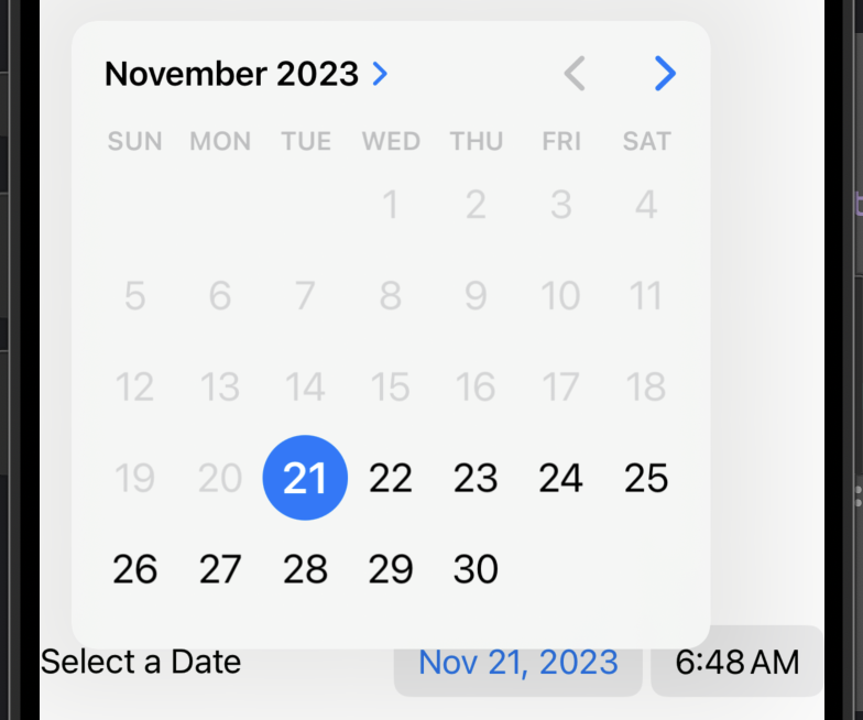
DatePicker graphical style
The next style we will cover is called graphical and it’s a style where you display an interactive calendar and/or time directly so the user does not have to click anything before choosing from the date picker.
DatePicker("Select a Date",
                   selection: $selectedDate,
                   displayedComponents: [.date, .hourAndMinute]
        )
        .datePickerStyle(.graphical)
The result:
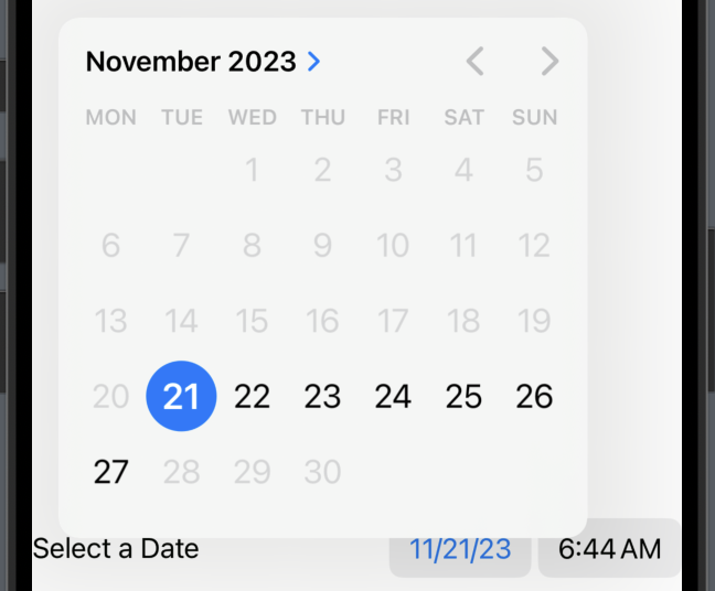
DatePicker compact style
The compact style is also the default choice from SwiftUI. Basically, it displays both date and time on one line and then you can click either date or time and then there will come a popup where you choose from.
DatePicker("Select a Date",
                   selection: $selectedDate,
                   displayedComponents: [.date, .hourAndMinute]
        )
        .datePickerStyle(.compact)
The result:

SwiftUI DatePicker date range
In SwiftUI, the DatePicker allows you to set a date range by using the in: modifier. This modifier enables you to define a closed range of valid dates for the user to choose from.
In the following example, we will create a DatePicker where you can choose dates within the next 7 days:
import SwiftUI

struct DatePickerView: View {
    @State var selectedDate: Date = Date()

    var body: some View {
        DatePicker("Select a Date",
                   selection: $selectedDate,
                   in: Date()...Date().addingTimeInterval(518400),
                   displayedComponents: [.date, .hourAndMinute]

        )
        .datePickerStyle(.compact)

    }
}
The result:
SwiftUI DatePicker minimum date
As we have just discovered in the section above, we can easily add a range for our DatePicker — we will use the same modifiers to set a minimum date for our DatePicker.
In the following example we will create a DatePicker where the minimum date is today:
import SwiftUI

struct DatePickerView: View {
    @State var selectedDate: Date = Date()

    var body: some View {
        DatePicker("Select a Date",
                   selection: $selectedDate,
                   in: Date()...,
                   displayedComponents: [.date, .hourAndMinute]

        )
        .datePickerStyle(.compact)
    }
}
The result:
SwiftUI DatePicker format
By default, the DatePicker displays the date and time format to match the system it’s working on. So if you are on an English/American system it will display your date and time as mm/dd/yy and AM/PM.
But if you want to force a specific format, there is no direct way to do that — but there is something you can do, so keep on reading.
SwiftUI DatePicker 24 hour format
In order to display and use the 24 hour format in your DatePicker you want to use the environment modifier and set the locale to a place the uses 24 hour format — like Germany or Denmark.
In the following example we will set the format to German:
import SwiftUI

struct DatePickerView: View {
    @State var selectedDate: Date = Date()

    var body: some View {
        DatePicker("Select a Date",
                   selection: $selectedDate,
                   in: Date()...,
                   displayedComponents: [.date, .hourAndMinute]

        )
        .datePickerStyle(.compact)
        .environment(\.locale, .init(identifier: "de"))
    }
}
The result:

SwiftUI DatePicker am pm format
Just like the 24 format, in order to set the format to AM/PM you want to set the locale to a place where they use that format.
In the following example we will create a DatePicker with AM/PM and locale set to en:
import SwiftUI

struct DatePickerView: View {
    @State var selectedDate: Date = Date()

    var body: some View {
        DatePicker("Select a Date",
                   selection: $selectedDate,
                   in: Date()...,
                   displayedComponents: [.date, .hourAndMinute]

        )
        .datePickerStyle(.compact)
        .environment(\.locale, .init(identifier: "en"))
    }
}
The result:

Wrap up SwiftUI DatePicker
In this blog post, we have covered how to implement a DatePicker in your application. We have discovered how we can customise the feel and look of our DatePicker.
I hope you enjoyed the short tutorial and can use it in your next application 🙂