In the world of iOS app development, SwiftUI has emerged as a powerful framework for building user interfaces. One of its fundamental components is the button. Buttons enable users to interact with your app, triggering actions and providing a seamless user experience. In this blog post, we’ll dive into SwiftUI buttons, exploring their versatility, customization options, and best practices.
By the end, you’ll be equipped with the knowledge to create beautiful and interactive buttons that elevate your app’s user interface.
Creating a Basic Button in SwiftUI
Let’s start with the basics. Creating a button in SwiftUI is incredibly straightforward. With just a few lines of code, you can have a functional button in your app.
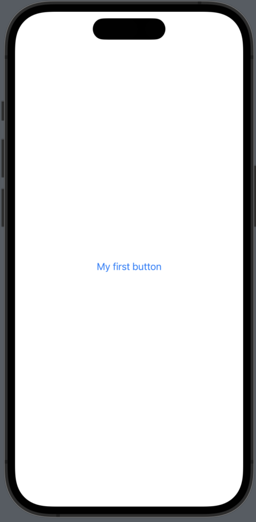
We will create a button that prints “You pressed me!” when tapped and the label will say “My first button”.
import SwiftUI

struct ButtonView: View {
    var body: some View {
        Button {
            print("You pressed me!")
        }label: {
            Text("My first button")
        }
    }
}
The result:
The cool part of creating your buttons that way, is you split your button action and label in a logical way – the action part is where you print and label is where you design your button.
In the label section, you can design whatever you want and create the button you want.
SwiftUI button style
In SwiftUI, buttons come with 5 built-in styles that allow you to customize their appearance to match your app’s design. Below you will learn how to change the button style in SwiftUI.
Automatic Button Style
The automatic button style is a simple, text-based button with no background or border. It inherits the styling from the operating system, giving it a native look and feel. You can create a default button by using DefaultButtonStyle() or .automatic modifier.
 .buttonStyle(.automatic)
 //Pick the one you want - they do the same
 .buttonStyle(DefaultButtonStyle())
Plain button style
The plain button style removes any background or border from the button, resulting in a text-only button with no visual styling. It’s useful when you want a minimalistic appearance or if you want a custom design – you can use it as a sort of reset modifier. You can create a plain button using PlainButtonStyle() or .plain modifier.
.buttonStyle(.plain)
 //Pick the one you want - they do the same
.buttonStyle(PlainButtonStyle())
The result:

As you can see, it removed the blue color and is pretty basic.
Bordered button style
The bordered button style adds a border around the button with the text inside. It’s a clean and modern style that can be customized with color and line width. You can create a bordered button using the BorderlessButtonStyle() or .bordered modifier.
.buttonStyle(.bordered)
//Pick the one you want - they do the same
.buttonStyle(BorderedButtonStyle())
The result:

And if you want to play around with the colors use the .tint modifier.
.tint(Color.red)The result:

Bordered prominent button style
Bordered prominent style is a great choise if you want a button to stand out in your app- The style makes the color stand out more and is stronger.
.buttonStyle(.borderedProminent)
//Pick the one you want - they do the same
.buttonStyle(BorderedProminentButtonStyle())
Let’s take the example above and create a bordered prominent style with red so you can see the difference.
.tint(Color.red)The result:

SwiftUI button size
At some point you probably want to change the size of a button or two — thankfully the good people at Apple knew this and made a few predefined sizes that are easy to use.
You can access these sizes by using the .controlSize modifier and there are four you can choose from:
.controlSize(.mini)
.controlSize(.small)
.controlSize(.regular)
.controlSize(.large)
The result:

SwiftUI button with spinner
If you want a spinner inside your button, you can add a ProgressView() to your button label. For example, when a user clicks a button and the app makes an API request you should show a spinner aka activity indicator until the request is done.
You can do that by showing a ProgressView() while waiting for the request to finish:
import SwiftUI

struct ButtonView: View {
    @State var isRequesting: Bool = false
    var body: some View {
        Button {
            fakeAPIRequest()
        }label: {
            if isRequesting {
                ProgressView()

            }else {
                Text("Make API request")

            }
        }
        .buttonStyle(BorderedProminentButtonStyle())
    }

    func fakeAPIRequest() {
        isRequesting = true
        DispatchQueue.main.asyncAfter(deadline: .now() + 2) {
            isRequesting = false
        }
    }
}
The result:

SwiftUI button disabled
You can easily disable a button by using the .disabled modifier. You want to set it to true if you want the button disabled and false if you want it enabled.
Let’s use the example above and disable the button while we are waiting for our fake API request:
import SwiftUI

struct ButtonView: View {
    @State var isRequesting: Bool = false
    var body: some View {
        Button {
            fakeAPIRequest()
        }label: {
            if isRequesting {
                ProgressView()

            }else {
                Text("Make API request")

            }
        }
        .disabled(isRequesting ? true : false) //<-- Disable button while requesting
        .buttonStyle(BorderedProminentButtonStyle())
    }

    func fakeAPIRequest() {
        isRequesting = true
        DispatchQueue.main.asyncAfter(deadline: .now() + 2) {
            isRequesting = false
        }
    }
}
The result:

SwiftUI button underline
If you want your text inside your button to be underlined, you simply add .underline() modifier to your text element inside the label:
 Button {
            print("Underline the text!")
        }label: {
                Text("I'm underlined")
                .underline()
        }
        .buttonStyle(BorderedProminentButtonStyle())
The result:

Conclusion
Buttons are essential elements in any app’s user interface, and SwiftUI provides a powerful and intuitive way to create them. By leveraging SwiftUI’s capabilities, you can create buttons that are not only visually appealing but also interactive and accessible. Whether you’re a beginner or an experienced SwiftUI developer, mastering buttons will enhance your app’s user experience and make your interface shine.